




DR PRADEEP SALGAONKAR lists out consumer reactions to a brand’s identity when the ownership and logo changes
For over decades, a certain shade of red and black was identity for a particular kind of Goan shopping experience. Walk into any outlet of one of the state’s oldest and most trusted retail chains, from its flagship stores in capital city, to its convenience outlets, and the red-and-black signage told you exactly what to expect. It served to fulfil people’s needs for fresh produce, a well-stocked wine and liquor section, a fish and meat counter that set the local benchmark, and a certain cosmopolitan polish that Goa’s retail landscape didn’t otherwise have. Built quietly over roughly 35 years by its founding family, the chain wasn’t just a supermarket. It was a piece of Goa’s consumption culture, a name that had become, for many households, simply ‘The good store.’
That chapter has recently closed. The Goa-based chain was acquired by a mainland retail group with a similar name, but a change in the logo and colour from red and black to yellow and white. The acquiring group, already running several dozen stores across two or three other states, with a strong gourmet and imported-foods focus, gained a ready-made coastal footprint along with the target’s premium liquor and lifestyle sub-brands. On paper, it may be a clean, strategic consolidation. However, on the ground, in the minds of Goan consumers, something more delicate may be underway with the transfer of the brand’s soul from one owner to another, with only the name held loosely in common.
The most visible signal of this transfer was a change in the logo’s colour, from the familiar red and black to the acquiring group’s own yellow and white. It sounds like a cosmetic detail. However, it is not. And, that is exactly the point this article wants to make, i.e. what happens to a brand’s identity when its ownership and its visual signature change at the same time, and what that means for business beyond the storefront.
Colour Change is not just a Colour Change
Companies often think of a logo as an identity element. Consumers however, experience it as a memory trigger. Think of the number of times a consumer may have encountered a particular logo over twenty or thirty years, on storefronts, shopping bags, advertisements, newspaper inserts, festival promotions, loyalty communications and signboards. Over time, the logo and colour becomes associated with experiences.
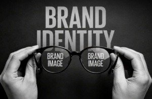 A change in visual identity can become a change in consumer perception, expectation and memory. Brand colour is not decoration. It is memory shorthand. Decades of behavioural marketing research point to the same conclusion. Consumers form associations with a brand’s colour palette long before they consciously register its name. Red and black, in this case, had accumulated over decades of meaning among consumers by way of trust, familiarity, reliability and the ‘good store of choice’. That association was never written down anywhere. It lived in muscle memory. It was automatic. When the colour changes, the brain’s shortcut breaks, because it is a different colour. The association breaks and there is a gap, even if every product on the shelf remains exactly the same.
This is why global marketing literature treats a rebrand, however minor it appears, as a moment of maximum vulnerability rather than a routine refresh. A logo or colour change, following an ownership transition typically produces one or all of three consumer reactions;
1. Confusion: The initial reaction to any changed signage is rarely analytical; it is instinctive uncertainty. Questions crop up in consumer’s mind, ‘Is this still the same store?’ ‘Did it shut down and something else move in?’ ‘Is the ownership still local?’ In a market, as identity-conscious as Goa, where ‘local versus outside’ carries real emotional weight, these questions are not trivial.
2. Scrutiny: Once confusion settles, consumers start actively auditing the experience for change, whether real or imagined. ‘Is the fish as fresh?’ ‘Are the vegetables fresh?’ ‘Has the staff changed?’ ‘Is the store as clean?’ Even if nothing operational has shifted, primed customers will notice things they wouldn’t otherwise have noticed, simply because the visual cue told them ‘something is different here.’
3. Loyalty erosion: Depending entirely on how the transition is managed, the repeat patronage and loyalty would be determined. If communication is transparent and the customer experience holds steady or improves, most of that scrutiny resolves into acceptance within a few months. If communication is silent, if customers are left to guess why their ‘good store’ suddenly looks unfamiliar, then the erosion can be lasting, because uncertainty about ownership starts to bleed into uncertainty about quality, pricing, and intent.
The Deeper Issue: Local trust meets outside ownership
Goa’s retail consumer seems to be unusually sensitive to the question of who is really behind a brand. The emotional contract a local brand builds isn’t only about product quality or service. It is with the promoter, it is with the identity, it is about a sense that the business understands the local palate, respects local rhythms (Goan culture, siesta hours, feast-days, the specific mix of Goan, local language, and neo-Goan customers), and is accountable to the community it serves.
When ownership moves out of state, and especially when the visual identity is aligned to the acquirer’s existing branding rather than retained as a standalone local sub-brand, it sends an implicit signal. It shouts aloud that ‘this is now being run to a template designed elsewhere’ and no more the local brand. That template, may well be superior in retail strategy, supply chain efficiency, category depth, customer focus, sourcing or overall service to customer. But the fact remains that ‘Efficiency’ and ‘Belonging’ are different currencies, and Goan consumers have historically been willing to pay a premium, in loyalty if not in price, for the belongingness and warmth in human relationships.
A change in visuals and colour of the logo, with alphabets in name remaining same, may complicate the matters in minds of consumers. It is close enough to preserve continuity for the inattentive shopper, but distinct enough that alert and observant, long-time customers will notice that the two are not same, but they are, in fact, entirely different entities sharing alphabets and phonetic overlap. In the short run, this may work to the acquirer’s advantage, easing the transition. However, it carries a strong reputational risk if the two brands (original and acquirer’s) are ever seen to diverge sharply in quality or values, since customers may struggle to disentangle who exactly they are frustrated with. And, once they are frustrated it calls for change in course of action.
Years of Experience
A brand’s colour is never just a colour. It is a container for years of accumulated experience. It is a shortcut that the human brain uses to skip the work of re-evaluating something familiar every single time it is encountered. Changing it, for any reason, forces customers to briefly step out of that shortcut and pay attention again. And, what they notice in that moment of renewed attention will shape how the brand is remembered for a long time afterward. Reality is that customers do not read merger press releases, but they read shop signage. And that makes a difference for them.
The lesson for any business bearing a well-established identity is not that colour and logo changes should be avoided. Brands do need to evolve, and sometimes a shift in ownership, strategy, or market positioning, genuinely calls for a new visual language, a brand logo change or a change in colour scheme.
The real lesson is that such a change should never be treated as cosmetic. It is a strategic decision and should be implemented with great caution. It is, whether intended or not, a message to every customer who has ever trusted that brand, logo and colour. The major question in this case should be; ‘Whether, like any important promotional message, this change is delivered deliberately and cautiously, explained honestly, and is it backed up by with an experience, that gives people a reason to trust the new colour and logo, as much as they once trusted the old one?’
The broader question always remains after a merger and logo or colour change is that, ‘How effectively was the transition facilitated by the new management and whether they were successful in bringing a subtle acceptance in the minds of lakhs of existing customers?’ The sales charts will answer these questions in years to come.